
The Mood-Boosting Power of Vintage Posters (How Classic Art Adds Joy to Your Space)
Think of the last time a splash of color or a touch of nostalgia brought a smile to your face. Vintage posters hold that mood enhancing magic. They’re more than just vintage wall art. With their bold colors, clever designs, and comforting old-school charm, they can shift the atmosphere in any room.
These timeless prints combine history, creativity, and positive vibes into one striking package. The vibrant colors lift energy, the retro graphics spark fond memories, and the stories from another time told in each image draw you in. If you want your home decor to feel brighter and happier, a classic poster can do the trick. Ready to find out why these prints work so well and how to best decorate a space with them? This post will walk you through everything you need to know to use vintage posters as everyday mood boosters.
Why Vintage Posters Lift Your Mood
It’s hard to look at a classic travel or advertising poster and not feel something shift inside. There’s a reason for that. The color choices, the way retro posters remind us of good memories, and the simple, bold imagery all work together. Each part does something special to bring out happy feelings and lift your spirits. Here’s how vintage posters create that feel-good effect.
Color Triggers Emotion
Color makes a big difference in how we feel each day. When you see posters with warm reds, oranges, or yellows, the room can feel more alive. These shades often set off a burst of energy or cheerful mood. In contrast, cool blues and greens make a place feel calmer and more peaceful.
This isn’t just guesswork. Color psychology research shows that reds and yellows often spark excitement and energy, while blues and greens help quiet the mind and ease stress. A quick look at this color psychology guide explains how colors can invite everything from motivation to tranquility into a room. Many vintage posters master this balance—mixing both warm and cool shades for a dynamic yet grounded feeling.
Nostalgia and Memory
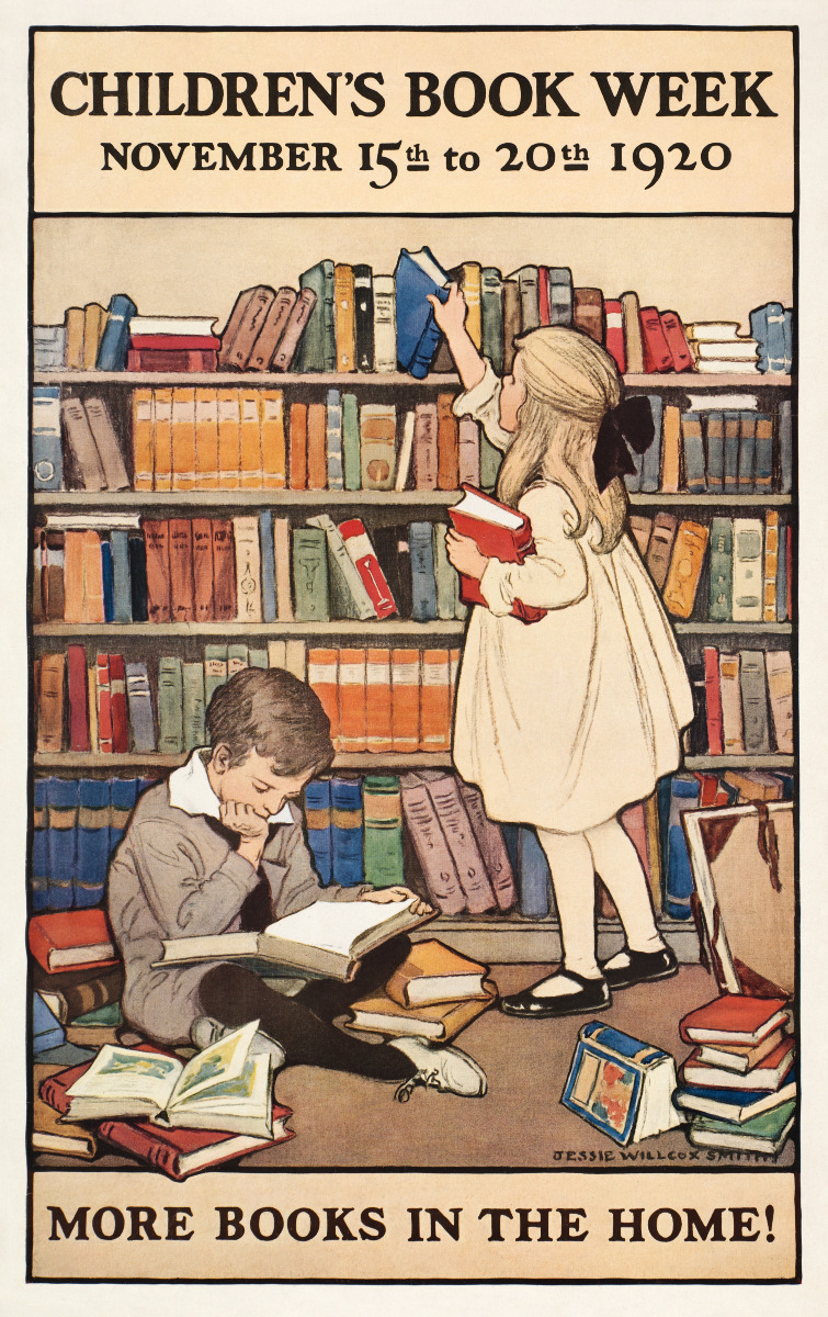
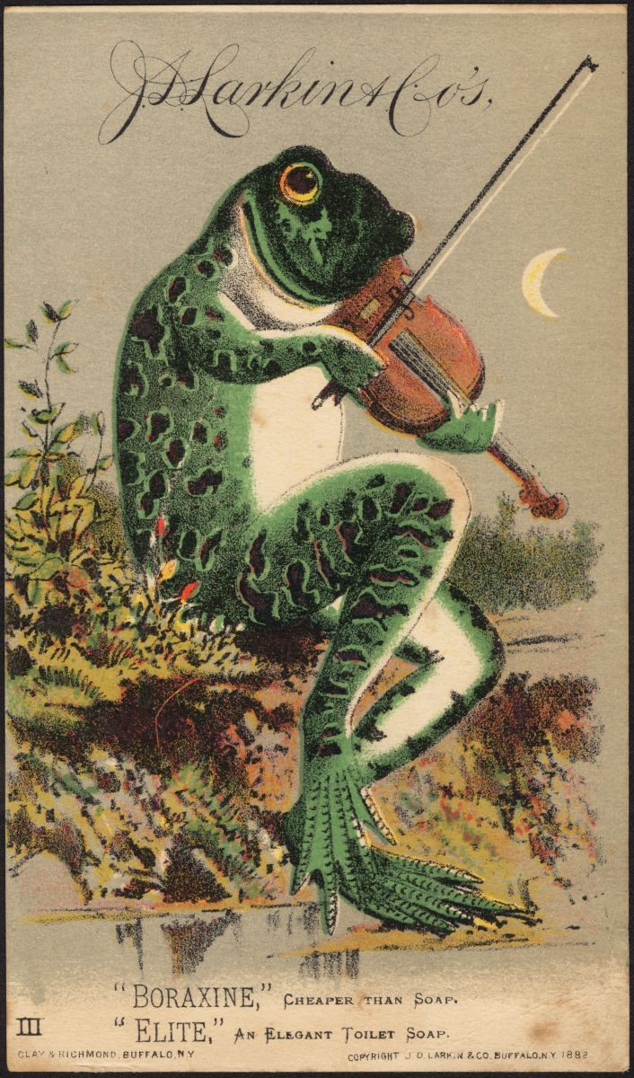
Retro posters do more than look good; they take us back in time. Art styles and fonts from the 1920s to the 1970s tend to stir up layered memories that unlock comfort and deeper emotion. If you grew up seeing certain advertising graphics, travel prints, or a movie poster, rediscovering them as nostalgic wall art can bring instant comfort.
This hit of nostalgia is powerful. Research shows that tapping into favorite memories can lower stress, boost happiness, and even strengthen a sense of belonging. The right retro print—maybe an old concert ad or a summer travel scene—can make your room feel more welcoming. Vintage posters provide shortcuts to these warm feelings because their look is tied to simpler, lighter times in our minds, often stirring laughter and comfort along the way.
Simple, Bold Imagery
One thing that stands out about classic posters is how simple they are. Instead of clutter or excessive detail, you usually get a shining image, a catchy slogan, or a bold logo. This isn’t just about style; it actually helps your brain feel less scattered.
Clear images are easy for our eyes and mind to process. When you spot a strong graphic or a bright phrase, your mind gets the immediate message. There’s no need to sort through lots of information. This instant clarity can give a quick mood boost, just like reading a favorite quote or seeing a familiar symbol.
In short, vintage posters use a mix of lively color, familiar style, and simple design to wake up your space and your mood. Their classic charm makes it easy for your mind to feel energized, soothed, and full of happy feelings—sometimes all at once.
Key Design Elements that Boost Happiness
Vintage posters do more than just decorate a wall—they brighten your mood through strategic use of vivid colors, cozy typography, and engaging textures. You can apply these design principles in your own home to bring warmth and make any room feel friendlier and more inviting. Whether you want to energize a kitchen or instill quiet joy in your bedroom, these timeless design moves continue to work as effectively today as they did decades ago.
Warm colors for energy
The quickest way to make a space feel lively is with warm colors. Reds, oranges, and yellows fill a room with energy and excitement, helping to bring warmth to your environment. Retro posters often used these vivid colors to catch the eye and spark interest. In modern home decor, those same dynamic hues can add zest without overwhelming the space.
- Try a cherry red or golden yellow print in your kitchen to boost morning energy.
- Introduce vibrant orange tones in a home office to inspire creativity and focus.
- Balance these bold shades with neutral walls or natural wood to keep the room harmonious.
Choosing artwork with splashes of warm color can transform the atmosphere, especially in areas where motivation and alertness matter most. These tones excel in spaces designed for gathering or productivity. For a deeper understanding of color effects on mood and practical design advice, explore The Psychology of Interior Design or this detailed color breakdown.
Cool tones for calm
If your aim is pure relaxation, turn to blues, greens, or soft purples. These calming hues soothe the mind and encourage quiet joy. Posters featuring serene blue skies or lush green landscapes have a natural ability to help you unwind.
- Display blue or green prints in the bedroom to support restful sleep.
- Use pastel blues or lavenders in a reading nook for added tranquility.
- Pair cool-tone art with soft lighting and cozy blankets for maximum comfort.
Cool tones reduce stress and make smaller spaces feel open and peaceful. They’re perfect where calm and relaxation come first. For more ideas on incorporating soothing colors, check out these tips on color psychology in home decor.
Friendly typography
Typography speaks volumes before you even read the words. Retro posters often featured rounded, hand-drawn, or playful fonts with a welcoming feel. This style is a great example of human-centric aesthetics, making a space feel approachable and cozy.
- Seek out posters with thick, rounded lettering—a visual hug that feels inviting.
- Hand-lettered fonts add a personal touch, like a friendly note from days gone by.
- Avoid sharp or blocky fonts in spaces meant for relaxation or socializing, as they can come across as cold or formal.
Choosing typography with soft curves or a handwritten vibe can instantly warm up your space. It’s a subtle yet powerful way to help guests feel at home.
Texture and material feel
Touch matters nearly as much as sight when it comes to design. The texture of your art can influence mood, even when viewed from across the room. Quality prints with excellent paper quality and tactile finishes make all the difference. Retro posters commonly appeared on matte paper or canvas, giving them a soft, gentle aesthetic. Some incorporated brushed metal for a distinctive, retro shine.
- Matte finishes reduce glare, allowing your art to be enjoyed any time of day.
- Canvas adds depth and texture, making prints feel like genuine paintings.
- Brushed metal elements add a cool, vintage edge for those who appreciate a bit of flair.
Selecting the right texture invites you to engage more deeply with your artwork every day, blending human-centric aesthetics with lasting quality.
All these design choices—color, typography, and texture—work together to elevate your mood. Vintage posters mastered this balance, and you can easily bring that same joy into your home.
How to Use Vintage Posters at Home
Incorporating vintage posters into your home decor goes beyond simply adding art to your walls. The right vintage wall art can evoke cherished memories, boost your mood, and help decorate a space that truly feels inviting. Here’s how to select, position, and style these timeless prints to complement your style, space, and budget.
Choosing the right size and theme
The size and theme of your vintage poster are just as important as the artwork itself. Picking well helps make a room cozier and can make a house feel like home.
- Start by measuring your wall. For smaller nooks, a single 12x18 or 18x24 inch print is ideal, while larger walls can accommodate a 24x36 inch poster or an arranged collection. Use painter’s tape and paper cut-outs to visualize the perfect dimensions first.
- Select a theme that resonates with you. Whether you prefer classic travel prints, vibrant food ads, iconic music posters, or whimsical attic finds, let your personal interests and favorite eras guide your choices. Surrounding yourself with images you love turns any room into a positive retreat.
- Aim for harmony. To keep things tidy, choose posters with consistent colors, frames, or subject matter. Even a gallery wall of varied pieces looks cohesive when tied together by a style thread.
For more tips on matching size and theme, explore this guide to vintage prints for a chic living room retreat.
Placement for maximum impact
Where you hang your vintage poster is crucial for creating an uplifting vibe.
- Position at eye level. Artwork looks best when its center is about 57 to 60 inches from the floor, helping vintage posters blend naturally into the room.
- Group in threes for energy. Arrange three prints side by side, vertically, or in a triangle—odd numbers create a dynamic visual appeal.
- Choose a statement piece. A large, colorful vintage poster can become a focal point above a sofa, bed, or entry table, commanding attention.
- Mind traffic flow and light. Avoid spots with harsh glare from windows, and place cheerful prints where you’ll see them often, such as hallway decor or your kitchen.
For inspiration on grouping and placement, check out ideas on revamping spaces with vintage wall art here.
Mixing with modern decor
Combine retro posters with contemporary designs for a fresh, balanced feel in your home.
- Pair with modern furniture. Retro posters come alive when hung above sleek sofas, near mid-century chairs, or framed against glass and metal accents.
- Use neutral walls to let colors pop. Whites, grays, and beiges create a clean backdrop that highlights bold vintage hues. Muted posters can contrast beautifully against vibrant wall colors.
- Incorporate industrial elements. Urban-inspired decor with rusty metals, exposed brick, or concrete ties retro posters seamlessly into modern interiors.
- Balance contrast thoughtfully. A bright 1960s travel print from Paris looks striking next to minimalist lamps or a geometric rug, making your space visually engaging as you merge eras.
For more on styling vintage prints with modern home decor, visit this practical guide to vintage prints in modern homes.
Vintage posters aren’t just decorative—they’re conversation starters and mood enhancers. With thoughtful choices, strategic placement, and stylish pairings, you can decorate a space that truly makes a house feel like home.
Science Behind the Mood Boost
Why do vintage posters make us feel so good? Scientists have discovered that color, familiar styles, and a touch of nostalgia combine to create a mood enhancing effect. These sensations aren’t just personal impressions; real research shows how our brains and bodies respond positively when we see familiar, uplifting images like vintage posters. Let’s explore what the studies reveal.
Studies on color and emotion
Researchers have long studied how colors influence our mood. A notable 2015 review highlights that the color red often sparks feelings of excitement or arousal, whereas blue tends to promote relaxation and calm. This explains why red appears in stop signs and fast-food logos to grab attention, while many hospitals and spas use blue to help people unwind.
In your home, displaying vintage posters with vibrant reds can liven up the atmosphere, while those featuring soft blues invite tranquility. For more insights, check out this review on color and psychological functioning.
Brain response to familiar art
Our brains are wired to recognize familiar art styles instantly. Seeing retro posters or designs that recall your past activates the limbic system—the part of the brain that handles emotions and memories. This reaction is immediate; the limbic system bypasses complex thinking and focuses on generating feelings of pleasure and comfort as soon as you recognize a classic look or style.
When you come across such familiar images, your mind triggers warm memories, evokes joy, and lights up the feel-good pathways. Research even shows that art engages the social and emotional centers of the brain, enhancing feelings of connection and happiness. For further insight, here is an article on how art engages the social brain.
Research on nostalgia effects
Nostalgic wall art offers more than just pleasant memories. Research from 2024 found that viewing nostalgic images—such as an old cereal ad or a vintage food label—can lower stress hormones like cortisol. These nostalgic visuals don’t only remind you of the past; they actively help your body relax and elevate positive emotions. This highlights how vintage posters serve as a simple and effective stress relief tool at home.
Recent studies emphasize that nostalgia can combat negative thoughts and boost your mood almost immediately. Find the latest research on how nostalgia promotes positive beliefs.
The science is clear: vintage posters use color, style, and memory to activate emotional “hot buttons” in the most mood enhancing way.
Conclusion
Vintage posters are an affordable, simple way to instantly enhance any room’s home decor. Their bold colors, classic fonts, and nostalgic charm do more than just look attractive; they bring positive vibes that elevate your mood and increase comfort, supported by both art and science.
Choose a design that resonates with you and display it where you'll see it regularly. You’ll notice the space feeling brighter and filled with happy feelings that make your environment a little more enjoyable.
Let your favorite vintage poster set the tone for your day. Thanks for reading—share your pick or memory in the comments, and try adding a vintage poster to your own space to experience the change firsthand.